Google IO
The Concept
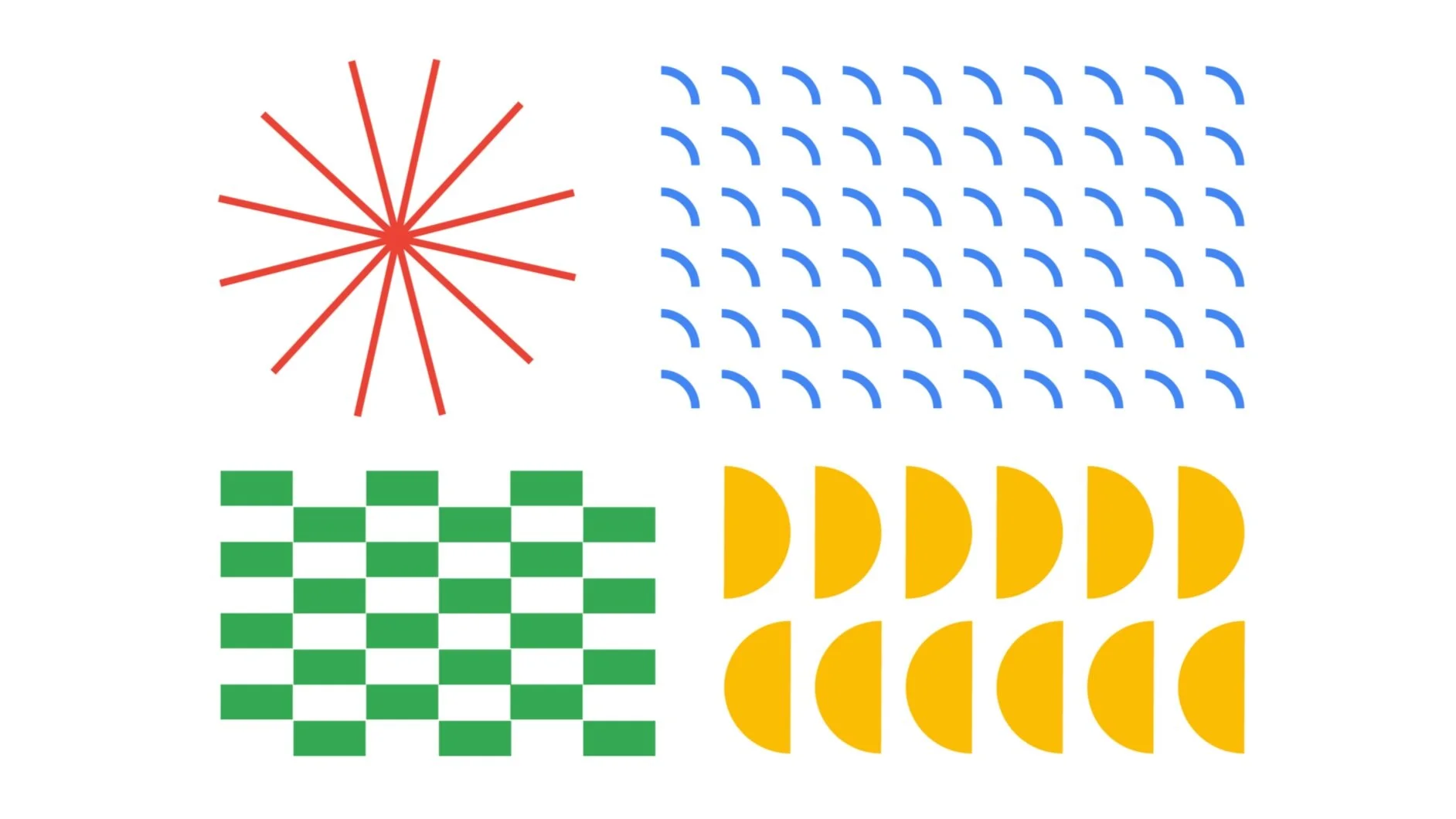
The branding for Google IO 2020 was built around the array—essentially a means for organizing and sorting information or objects in mathematics and development. We used various forms of arrays (radials and grids) to loosely represent different types of people coexisting and working together, attempting to show that a whole is greater than the sum of it’s parts—not unlike all of the talented people who attend Google IO.


The Countdown
For the countdown to IO, we created an interactive clock where different shapes represent the seconds, minutes, hours, and weeks of the approaching event, and you can watch them tick away in real time. We also created some fun haptic animations that allowed you to do things like turn shapes various directions, spin wheels, or upon click, go into a whole different colorway.